

One of the most common web design mistakes is letting the business owner pick the colours, the photography and the writing style by personal taste. A site does not have to please you. It has to speak to the customer you are trying to reach, answer their questions, reduce their hesitation and help them take the next step.
Why this is the most damaging of all web design mistakes
Because it is the only one that never shows up in review. The site ships, the owner is happy, the team is happy, and then months pass without a single enquiry. Nobody connects the two, so the conversation turns to SEO or ads while the real problem is that every page was written for one person: the owner.
The gap is not theoretical. A factory owner likes dark grey and architectural photography. His buyer is a procurement engineer looking for a spec sheet, a lead time and a number to call. The grey will not lose the sale. The missing spec sheet will.
Telling taste apart from need before the mistakes creep in
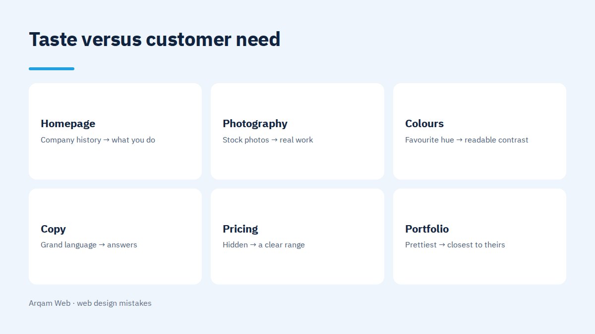
Most web design mistakes trace back to one blurred line. Not every personal opinion is wrong, and the working rule is simple: taste is allowed in the look, not in the order or the content.
| Decision | Taste says | The customer needs |
|---|---|---|
| Homepage opening | Company history and founding year | What you do and who for |
| Photography | The office building and generic stock | The product or the work you actually delivered |
| Colours | The owner’s favourite colour | Enough contrast that buttons show and text reads |
| Copy | Grand language and long sentences | Short sentences that answer a question |
| Pricing | Hidden until they call | A range or a pricing method that saves both sides time |
| Portfolio | The prettiest work | The work closest to their own case |
That last row causes more web design mistakes than any other. Most companies lead with their prettiest project, while the visitor is hunting for something that resembles theirs. A clinic owner wants to see a clinic site, not a travel company site however handsome it is.
One service, two audiences, two pages
An interior design firm sells one service to two buyers. The first is an apartment owner wanting a fit-out. The second is a project manager at a developer wanting a hundred units finished. The service is the same and the page cannot be:
- The apartment owner wants lots of finished-work photos, a cost range per square metre, a rough timeline, and to know whether design includes execution.
- The project manager wants a schedule, capacity, references at the same scale, contract terms and late-delivery penalties.
Designed on the owner’s taste, this becomes one handsome photo page that serves the first buyer and loses the second entirely. Avoiding web design mistakes here does not mean a longer page. It means two pages, each for its audience.
The four foundations a design should rest on
- Brand identity. Identity is not taste. It is a system that makes the company recognisable at every touchpoint, and having one settles the colour and typeface arguments before they start.
- What the target customer needs. What they already know before arriving, what they do not, and the words they use to ask. That decides your terminology and the order of the sections.
- The information that moves the purchase. Price or price range, lead time, what the quote includes and excludes, warranty, and who has done a case like theirs.
- What separates you from competitors. Not adjectives, but a difference that can be checked: delivery inside a stated window, full ownership handed to the client, post-launch support written into the contract.
Five questions that prevent most web design mistakes
- Who opens the site and who signs off? Often not the same person.
- What were the last three questions a customer asked before agreeing? Those questions are your page sections.
- Which objection usually stalls the deal? Put it on the page and answer it before it is raised.
- What evidence convinces your buyer? A number, a published project, or a client name they recognise.
- What do they do once convinced? The button for that action should be the clearest thing on the page.
How to test that the site is built for your customer
The quickest way to surface web design mistakes needs no tools. Put the homepage in front of somebody from your target audience who has never seen it, and after five seconds ask three questions. What does this company do? Who for? What is the next step? Any hesitation is a problem with the page, not the person.
After launch the answer gets sharper, and the list of web design mistakes stops being a matter of opinion. Session recording shows where visitors stall and where they click something that is not clickable, and those spots are the real fix list instead of another argument about taste. We went into this in more depth in how to make your site stand out.
The web design mistakes we see most often
- Copy about the company everywhere and about the customer nowhere. Count how many times “we” appears against “you”.
- Stock photos of people with no connection to the business. They cost more trust than they add polish.
- Small type and weak contrast. Elegant on the designer’s screen, unreadable on a phone in daylight.
- A menu full of internal names. The visitor is looking for their service, not your department.
- Every price hidden. It saves your time on paper and costs you the serious buyer who dislikes surprises.
- Mobile as an afterthought. Most visits come from a phone while the design is only reviewed on a large screen.
Most web design mistakes start from not knowing what a website is made of. Read what a website is actually made of before you argue about how it looks.
Frequently asked questions
What are the most common web design mistakes?
Building the site around the owner’s taste instead of the target customer’s need. It shows up as a homepage that talks about the company, photography that never shows the actual work, and the absence of the information a buyer decides on, such as price range and lead time.
Does my opinion on my own website not matter?
It matters in its place. Your view settles the identity, the overall impression and whether the design represents your company. The order of sections, what they contain and where the buttons sit are settled by customer need and by what measurement shows after launch, not by preference.
How do I learn what my customer needs without expensive research?
From the questions you already receive. Go through the last ten WhatsApp conversations or sales calls and write down the repeated questions. That list beats any general study, because it comes from your customers rather than a hypothetical market.
Should prices go on the website?
For most services, yes, even as a range or a pricing method. A visitor who finds no price signal assumes the worst or moves to a clearer competitor, and enquiries that arrive with no sense of the range burn your team’s time filtering people who were never going to buy.
Which web design mistakes need a rebuild rather than a tweak?
When the structure itself fails the customer: services bundled onto one page, no page per service, and copy written entirely about the company. Tweaks fix colours and wording. They do not fix a structure built on the wrong premise.
Review your site through your customer’s eyes
If you want an outside read, we go through your homepage and one service page and send written notes on what your customer sees, before any talk of a project. Details on the web design and development page.
Request a quote · Message us on WhatsApp · Call us
Arqam Web
44 Central Axis, Al Saraya Mall, Lower Ground, Entrance 2, Sheikh Zayed, Giza, Egypt
Phone and WhatsApp: +20 111 872 1404 · Email: info@arqamweb.com
For the underlying usability principles, see Nielsen’s ten usability heuristics.