

RTL web design is not a stylesheet flipped from left to right. Changing direction moves margins, arrows, table column order and form alignment, and it treats numbers and Latin words by separate rules. The mistakes below are the ones that actually break Arabic pages, ordered by how often we find them in audits.
What does RTL web design actually involve?
Direction is a property of the document, not the text alone. You set it with dir="rtl" and lang="ar" on the html element, and from then “start” and “end” change meaning across the page. Start is now the right.
Every rule written with the literal word left or right stays where it was, which causes most of what looks broken. The difference between a comfortable Arabic site and a tiring one lives in small details: where the arrow sits, where a phone field ends, whether a table reads from the right.
The biggest mistake: flipping only the stylesheet
The common approach to RTL web design loads a mirrored stylesheet on top of the original. It works on the first page and fails on everything after, because any new component written the old way snaps back to the left, and a theme update wipes the overrides.
The alternative is logical properties from the start: margin-inline-start instead of margin-left, padding-inline-end instead of padding-right, inset-inline-start instead of left. Those follow document direction on their own, so both versions run off one file.
Elements that break when direction changes
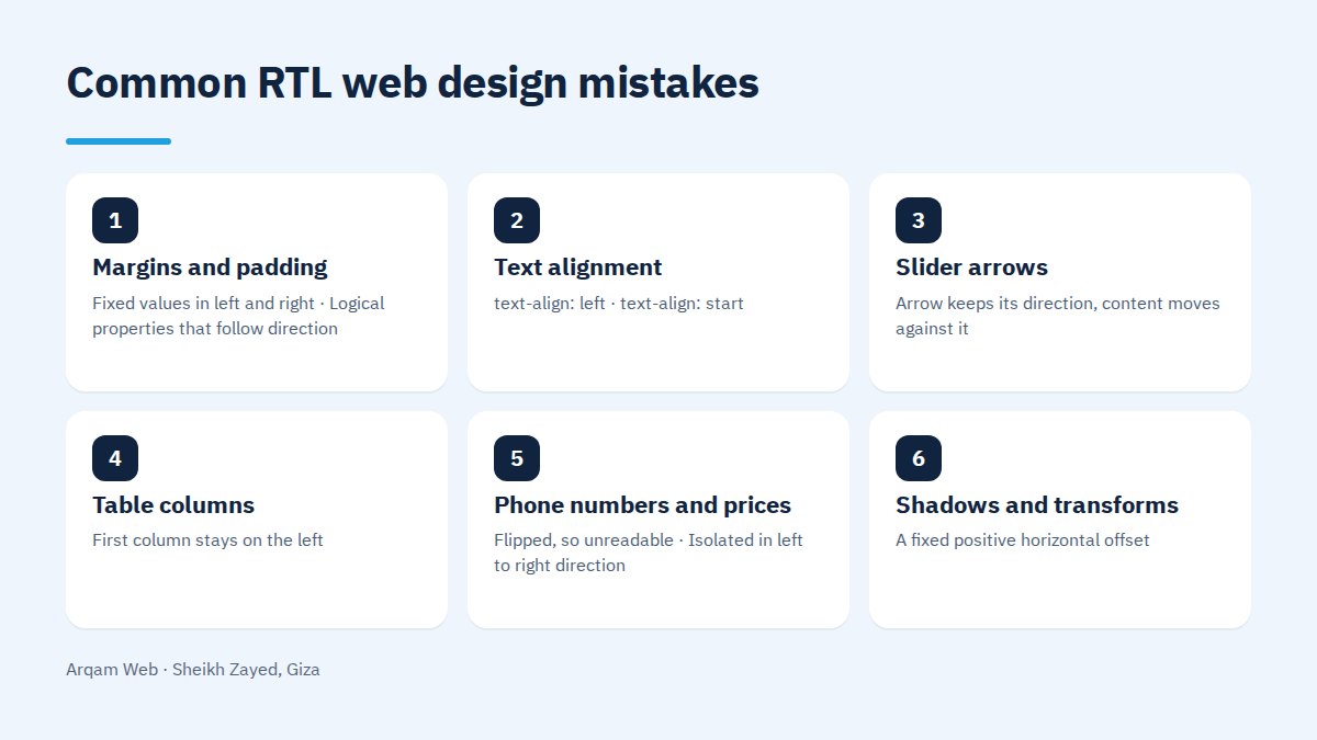
| Element | Common mistake | What it should be |
|---|---|---|
| Margins and padding | Fixed values in left and right | Logical properties that follow direction |
| Text alignment | text-align: left |
text-align: start |
| Slider arrows | Arrow keeps its direction, content moves against it | Direction and slide order flipped together |
| Table columns | First column stays on the left | First column starts at the right, order reverses |
| Phone numbers and prices | Flipped, so unreadable | Isolated in left to right direction |
| Shadows and transforms | A fixed positive horizontal offset | Offset sign inverted in the Arabic version |
| Letter spacing | letter-spacing inherited from a Latin design |
Zero, because it pulls joined Arabic letters apart |
That last row is the most frequent fault in RTL web design and the least noticed. Spacing that flatters a Latin typeface takes an Arabic word apart letter by letter.
Icons and arrows: what mirrors and what does not
The rule in RTL web design is that anything carrying a direction mirrors, and anything without one stays put. Arrows, back buttons and progress indicators mirror. These do not:
- The logo and any trademark drawn in a fixed orientation.
- Play, pause and skip controls in audio and video players.
- Tick marks and error crosses.
- Icons with no inherent direction: an envelope, a bell, a padlock.
- Photographs, above all with text inside the image.
The “next” arrow deserves attention. In the Arabic version it points left, and its position in the control bar moves to the opposite side. Handling one without the other makes a visitor press it and then suspect it is broken.
Numbers, mixed text and forms
Numbers read left to right in every case. A phone number or a price inside an Arabic sentence needs explicit isolation with a bdi element, or brackets and punctuation jump to the wrong end of the line.
The same applies to Latin product names inside Arabic copy. Forms then need three passes: label alignment, the position of the asterisk marking a required field, and the direction of email and phone inputs, which stay left to right whatever the page does. A validation message belongs under its field, aligned from the right.
Arabic typefaces and their effect on RTL web design
Arabic reads smaller than Latin at the same size, and its real height is greater. Arabic copy carrying the same settings as the English looks cramped, and needs a slightly larger size with a wider line height to become comfortable.
A second failure is silent: a typeface with no Arabic glyphs, so the browser substitutes one and the heading appears nothing like the design. Synthetic bold and italic also distort Arabic letterforms, so a real weight from the same family is safer.
Bilingual sites: structure before design
The decision that saves time in bilingual RTL web design is giving each language its own pages at its own addresses, rather than a button translating text in place. In-place translation loses indexing, confuses the two versions in search results, and doubles the work on every content edit.
On the Solafet Alsharq project, a Saudi hospitality supplier serving major Saudi hotel groups, the site runs in Arabic with a full right to left layout, and the project page records that it was built for Arabic from the first layout rather than mirrored afterwards.
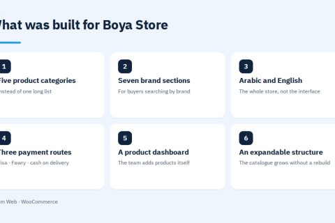
The Forsan Pools project, a pool-service company in Riyadh, states the principle outright: right to left is not a stylesheet flip, and every layout, icon direction, form field and caption was built for Arabic from the start. Boya Store, an Egyptian paint retailer, runs live in Arabic and English across five categories and seven brands, each with its own section.
How do you check the RTL web design on your own site?
The check needs no tooling and exposes most faults inside fifteen minutes:
- Open the page on a phone and read from the right. Any element forcing your eye left is a fault.
- Type a phone number inside an Arabic sentence and watch where brackets and commas land.
- Press the next arrow in a slider and confirm content moves the way the arrow points.
- Submit the form empty and read the error: position, alignment, language.
- Shrink the browser window and watch which element leaves the screen first.
- Block the font from loading and see which typeface renders the heading.
- Switch to the English version and back, and confirm you land on the same page.
A wider list of what spoils pages sits in web design mistakes.
Frequently asked questions
Is dir=”rtl” enough on its own?
No. The attribute reverses reading order and the flow of inline content, but it touches nothing written explicitly as left or right, does not correct icon direction, does not isolate numbers, and does not adjust Arabic type size. It is the first step of several.
What is the single most common RTL mistake?
Aligning text with left instead of start, followed by slider arrows that keep their original direction. The first leaves paragraphs hanging on the wrong side. The second makes a visitor press an arrow, see content move the opposite way, decide the site is broken and leave.
Should I use Latin or Arabic-Indic digits?
Both are acceptable, and consistency across the site matters more than the choice. Latin digits suit prices, phone numbers and order references because visitors copy them elsewhere. Arabic-Indic digits sit better in literary copy and dates inside purely Arabic content.
Does an Arabic site need a different design or the same one mirrored?
Mostly the same design, with adjustments that never show in a stylesheet diff: a slightly larger type size, a wider line height, and shorter headings because Arabic occupies space differently. Grid, layout and colour stay as they are. What changes is the visual rhythm inside them.
What about the English version of an Arabic site?
It needs its own addresses and hreflang tags pairing each page with its counterpart, plus navigation written in English rather than machine translated. Most important, the language switch should carry the visitor to the same page in the other language instead of the home page, which is what most sites do.
Have the direction on your site checked
Send your site address and you will get a list of what breaks the RTL web design across its pages, ordered by what a visitor notices first, separating stylesheet fixes from rebuilds. What we handle is on the web design and development page.
Request a quote · Message us on WhatsApp · Call us
Arqam Web
44 Central Axis, Al Saraya Mall, Lower Ground, Entrance 2, Sheikh Zayed, Giza, Egypt
Phone and WhatsApp: +20 111 872 1404 · Email: info@arqamweb.com