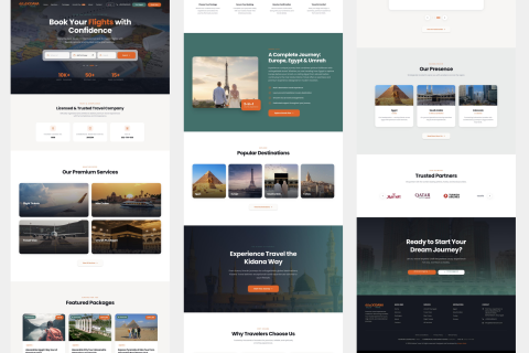

Boya Store Case Study:
Colour Everywhere, Brand Intact
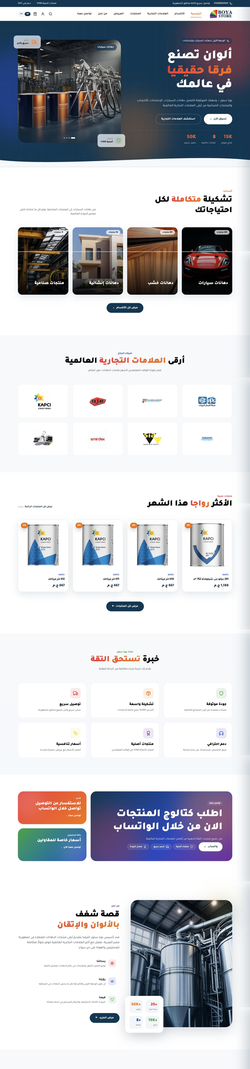
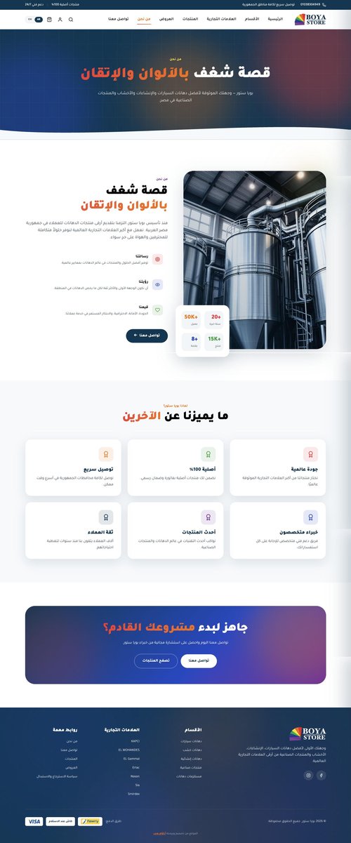
One of Egypt's larger paint retailers, carrying well known international brands. They wanted a store that looked nothing like the usual catalogue site, one full of colour, without letting go of the identity the company already had.
Visit Website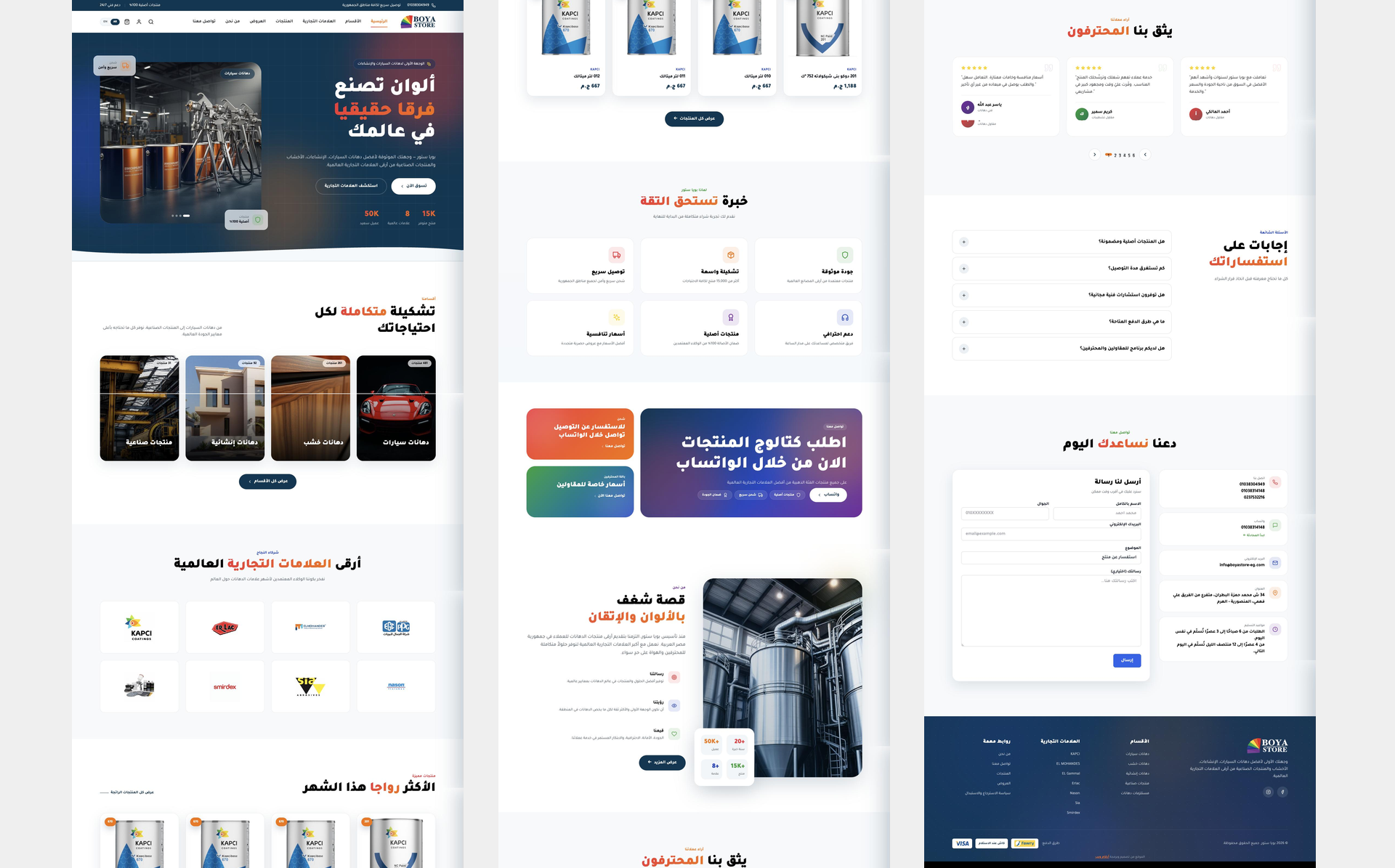
The numbers speak for themselves
Lead Generation
PageSpeed Score
Organic Traffic
Avg. Load Time
Visual Showcase
Crafted with precision, down to the pixel

Overview
How we transformed this business

The Problem
A paint retailer's website has an obvious temptation and an obvious trap. Fill it with colour and it stops looking like the company. Keep it strictly on brand and it looks like every other catalogue. The company wanted both at once. Underneath that sat a practical requirement: room for a large and growing number of products, and a dashboard their own team could work in.

Our Approach
We went through the requirements and the data the company already had before choosing anything, and picked the build to match what the catalogue would need to carry. Then we designed. The first direction went to the client, who approved it and came back with additions and changes. We worked through those rounds until the design was the one they wanted, and only then started development.

The Outcome
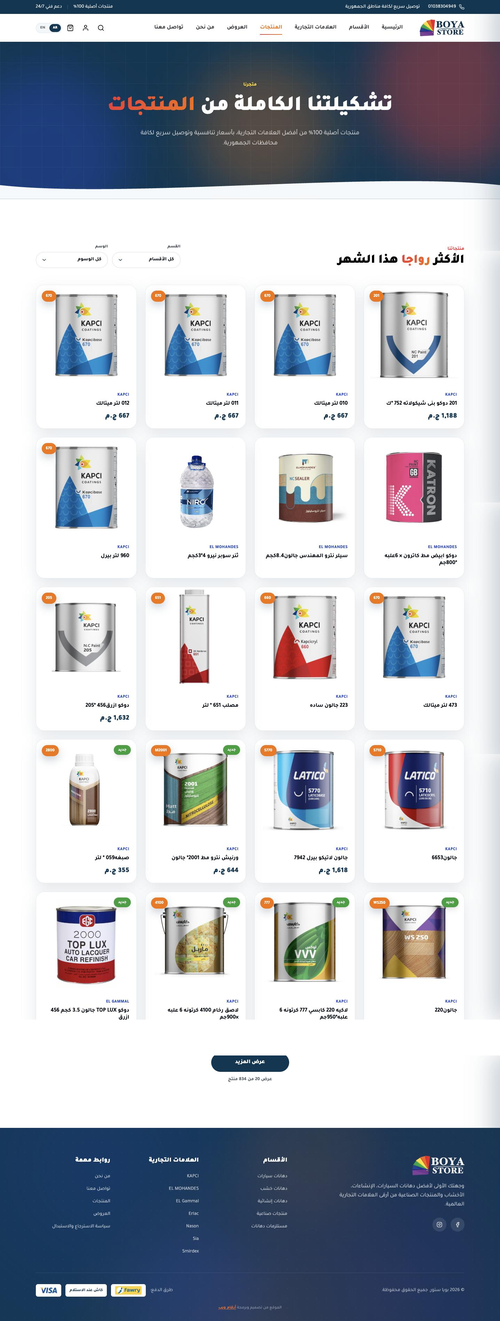
The store is live in Arabic and English across five categories and seven brands, each brand with its own section. Development finished inside the agreed timeline. We reviewed the whole store with the client in the primary language before translating the pages and loading products, and the team has been adding to the catalogue since.
Project Story
From vision to launch — every step, intentional
- Went through the company’s requirements with them in full
- Reviewed the product data they already held and how it was organised
- Established what the catalogue would need to carry as it grew
- Chose the platform and structure to match, rather than the other way round
- Designed a colour-led store that still reads as the company
- Presented the first direction to the client
- Took their additions and changes and worked them in
- Kept going until the design was approved as theirs
- Built the store on the structure set in the first phase
- Built the catalogue to hold a large and growing number of products
- Built the dashboard so the team loads and manages products themselves
- Finished development inside the agreed timeline
- Walked the client through the store in the primary language
- Checked each part against what had been agreed
- Fixed what came out of that review before going further
- Confirmed the build matched the approved design
- Translated the pages into the second language
- Loaded the agreed products into the catalogue
- Set up the five categories and the seven brand sections
- Handed the store over to the client’s team
What We Built
Performance & Delivery

A Catalogue Built to Grow
The structure was chosen at the start for a catalogue that keeps expanding, and the client’s team is still adding to it.

A Section for Every Brand
Seven international brands, each with its own storefront inside the store, so a customer shopping by brand never has to filter for it.

Colour as the Layout
The store is built out of colour rather than decorated with it, which is the point when what you sell is paint.

A Dashboard Their Team Runs
Products, categories and brands are all managed by the client’s own staff, without coming back to us to add a line to the catalogue.

Arabic and English
The store runs in both languages, with the pages translated after the build had been reviewed and signed off in the primary one.

Checkout Built for the Market
Visa, Fawry and cash on delivery, so the store matches the ways their customers already pay rather than the ways a template offers.
Behind the Results
Why this project succeeded

Colour Without Losing the Brand
The obvious version of this site would have been wrong.
A paint retailer’s store is an invitation to fill the screen with colour, and doing that would have buried an identity the company had already built. Keeping strictly to the brand palette would have produced the same catalogue page as everyone else. The design had to be led by colour and still read as this company, and that tension is the whole design problem.

We Started From Their Data
The catalogue decided the build.
Before choosing a platform we went through the product data the company already held and how it was organised. What the catalogue would have to carry, and how the team would keep adding to it, is what set the structure. Picking the build first and forcing the products into it is how stores end up impossible to maintain a year later.

The Design Became Theirs
Approval is not the end of a design round.
We presented the first direction and the client approved it, then asked for additions and changes. We worked through those until it was the store they had in mind rather than the store we had drawn. Development did not start until that point, which is cheaper for everyone than discovering it during the build.

Reviewed Before It Was Translated
Fix it once, not twice.
We walked the client through the finished store in the primary language and checked it against what had been agreed before any translation started. Anything that needed changing was changed once. Translating first and reviewing after means every correction has to be made in both languages.
Sound Familiar?
What This Means For You
- Struggling with low traffic and zero visibility?
- Poor conversion rates despite good products?
- Slow, outdated website hurting your credibility?
- Competitors outranking you on every search?
Let's achieve similar results for your business.
A Store That Can Hold Your Whole Catalogue?
We build online stores around the products you actually have and the way your team actually works, with a dashboard they can run without us.