

دراسة حالة Boya Store:
ألوان في كل مكان، وهوية سليمة
واحد من أكبر تجار الدهانات في مصر، يوزّع علامات تجارية عالمية معروفة. أرادوا متجرًا لا يشبه مواقع الكتالوجات المعتادة في شيء، متجرًا مليئًا بالألوان، دون التخلي عن الهوية التي تملكها الشركة بالفعل.
زيارة الموقع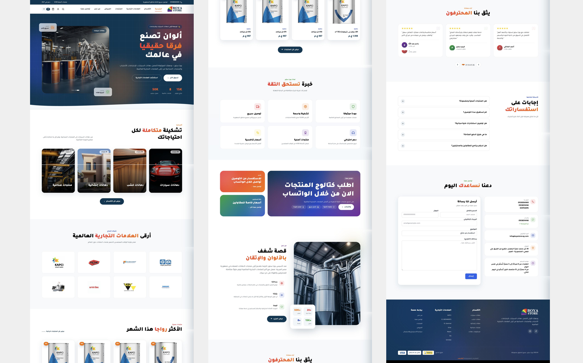
الأرقام تتحدث عن نفسها
توليد العملاء المحتملين
درجة PageSpeed
الزيارات العضوية
متوسط زمن التحميل
عرض بصري
صُنع بدقّة حتى آخر بكسل
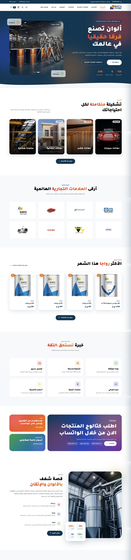
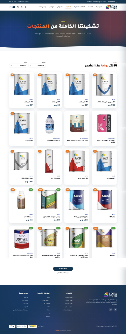

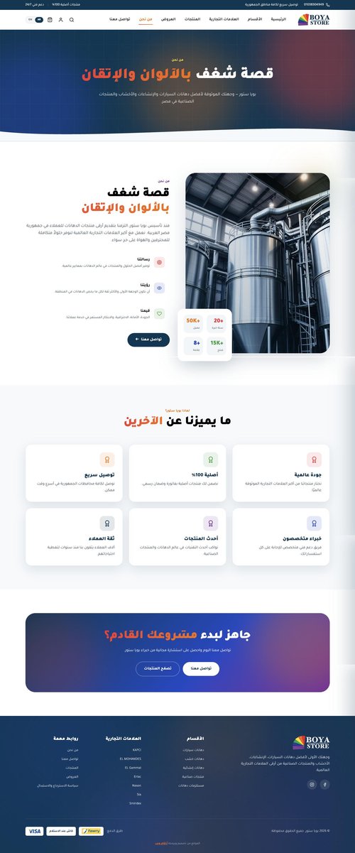
نظرة عامة
كيف طوّرنا هذا العمل

المشكلة
موقع تاجر الدهانات أمامه إغراء واضح وفخ واضح. املأه بالألوان فيتوقف عن الشبه بالشركة. التزم بالهوية بصرامة فيبدو مثل أي كتالوج آخر. أرادت الشركة الاثنين معًا. وتحت ذلك كان هناك متطلب عملي: مساحة لعدد كبير ومتزايد من المنتجات، ولوحة تحكم يستطيع فريقهم العمل عليها.

منهجنا
راجعنا المتطلبات والبيانات المتوفرة لدى الشركة قبل اختيار أي شيء، واخترنا طريقة البناء بما يناسب ما سيحمله الكتالوج. ثم صممنا. ذهب الاتجاه الأول إلى العميل، فاعتمده وعاد بإضافات وتعديلات. عملنا على تلك الجولات حتى صار التصميم هو ما أرادوه، وعندها فقط بدأنا التطوير.

النتيجة
المتجر يعمل الآن بالعربية والإنجليزية عبر خمس فئات وسبع علامات تجارية، لكل علامة قسمها الخاص. انتهى التطوير ضمن الجدول الزمني المتفق عليه. راجعنا المتجر كاملًا مع العميل باللغة الأساسية قبل ترجمة الصفحات وتحميل المنتجات، والفريق يضيف إلى الكتالوج منذ ذلك الحين.
قصة المشروع
من الرؤية إلى الإطلاق — كل خطوة مدروسة
- Went through the company’s requirements with them in full
- Reviewed the product data they already held and how it was organised
- Established what the catalogue would need to carry as it grew
- Chose the platform and structure to match, rather than the other way round
- Designed a colour-led store that still reads as the company
- Presented the first direction to the client
- Took their additions and changes and worked them in
- Kept going until the design was approved as theirs
- Built the store on the structure set in the first phase
- Built the catalogue to hold a large and growing number of products
- Built the dashboard so the team loads and manages products themselves
- Finished development inside the agreed timeline
- Walked the client through the store in the primary language
- Checked each part against what had been agreed
- Fixed what came out of that review before going further
- Confirmed the build matched the approved design
- Translated the pages into the second language
- Loaded the agreed products into the catalogue
- Set up the five categories and the seven brand sections
- Handed the store over to the client’s team
ما الذي بنيناه
الأداء & التسليم

A Catalogue Built to Grow
The structure was chosen at the start for a catalogue that keeps expanding, and the client’s team is still adding to it.

A Section for Every Brand
Seven international brands, each with its own storefront inside the store, so a customer shopping by brand never has to filter for it.

Colour as the Layout
The store is built out of colour rather than decorated with it, which is the point when what you sell is paint.

A Dashboard Their Team Runs
Products, categories and brands are all managed by the client’s own staff, without coming back to us to add a line to the catalogue.

Arabic and English
The store runs in both languages, with the pages translated after the build had been reviewed and signed off in the primary one.

Checkout Built for the Market
Visa, Fawry and cash on delivery, so the store matches the ways their customers already pay rather than the ways a template offers.
خلف النتائج
لماذا نجح هذا المشروع

Colour Without Losing the Brand
The obvious version of this site would have been wrong.
A paint retailer’s store is an invitation to fill the screen with colour, and doing that would have buried an identity the company had already built. Keeping strictly to the brand palette would have produced the same catalogue page as everyone else. The design had to be led by colour and still read as this company, and that tension is the whole design problem.

We Started From Their Data
The catalogue decided the build.
Before choosing a platform we went through the product data the company already held and how it was organised. What the catalogue would have to carry, and how the team would keep adding to it, is what set the structure. Picking the build first and forcing the products into it is how stores end up impossible to maintain a year later.

The Design Became Theirs
Approval is not the end of a design round.
We presented the first direction and the client approved it, then asked for additions and changes. We worked through those until it was the store they had in mind rather than the store we had drawn. Development did not start until that point, which is cheaper for everyone than discovering it during the build.

Reviewed Before It Was Translated
Fix it once, not twice.
We walked the client through the finished store in the primary language and checked it against what had been agreed before any translation started. Anything that needed changing was changed once. Translating first and reviewing after means every correction has to be made in both languages.
هل يبدو هذا مألوفًا؟
ماذا يعني هذا لك
- تعاني من زيارات قليلة وظهور شبه معدوم؟
- معدلات تحويل ضعيفة رغم جودة منتجاتك؟
- موقع بطيء وقديم يضرّ بمصداقيتك؟
- منافسوك يتفوّقون عليك في كل عملية بحث؟
لنحقّق نتائج مماثلة لأعمالك.
متجر يتسع لكتالوجك كاملًا؟
نبني المتاجر الإلكترونية حول المنتجات التي لديك فعلًا والطريقة التي يعمل بها فريقك فعلًا، مع لوحة تحكم يديرونها من دوننا.
ذات صلة مشاريع.
Kidana Travel Social Media
Social Media Marketing for Hajj and Umrah
موقع Mr Clone
صفحة واحدة مبرمجة خصيصًا لاستوديو توائم رقمية بالذكاء الاصطناعي
موقع Rabia
صفحة واحدة مبنية حول شعار