

AGTA Logo Competition:
The Mark That Won, and Is Now in Official Use
The AGTA logo on agtaweb.org today is ours. The Airport Ground Transportation Association, which has represented airport operators, ground transportation companies and industry suppliers since 1946, ran a competition to replace its mark. Arqam Web entered through Telgints, with Ibrahim Salah, Head of Design, leading the work. Our entry reached the final stage, and the logo we submitted was adopted as the association's official identity.
Visit AGTA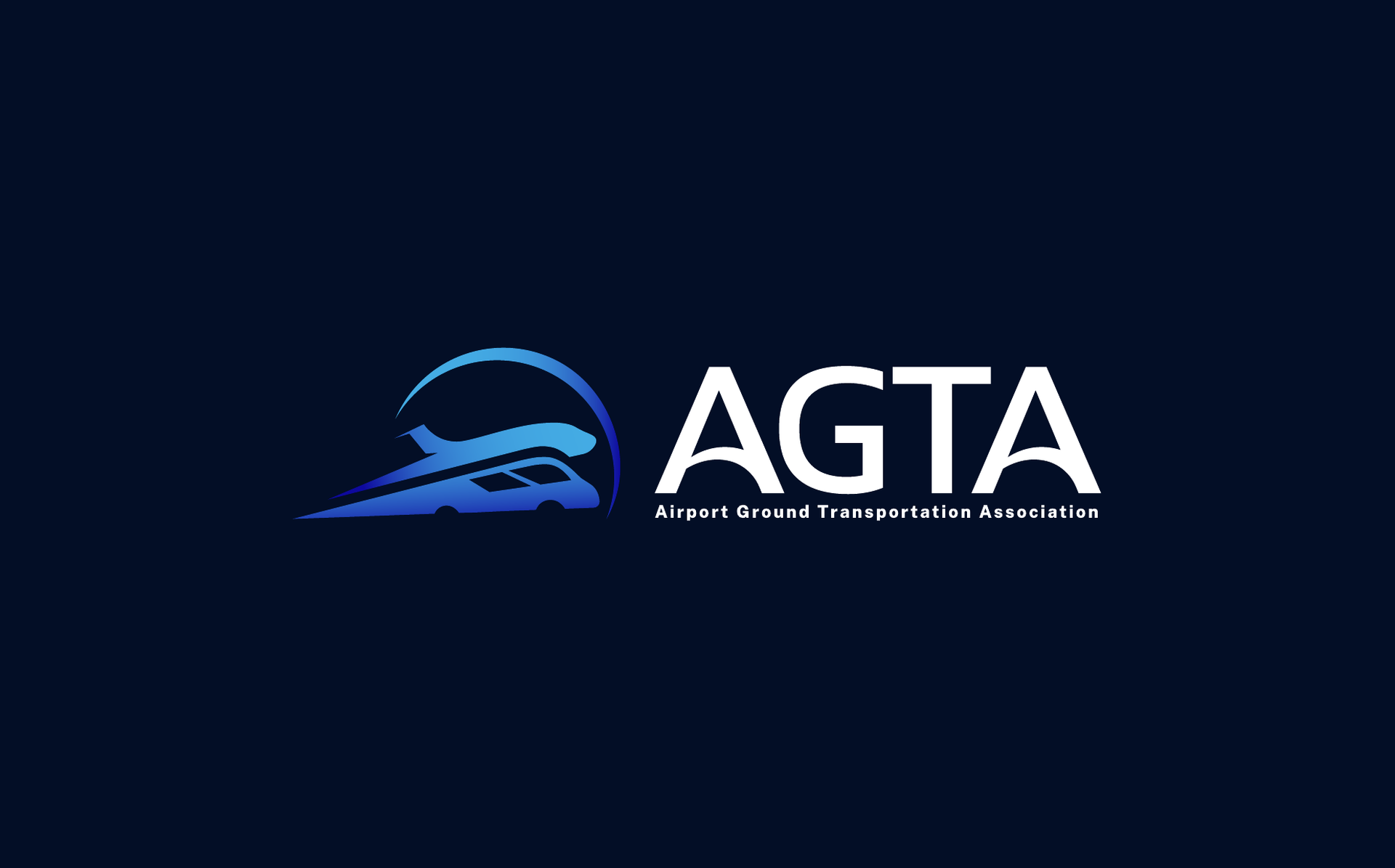
The numbers speak for themselves
AGTA founded
Logo versions delivered
Lockups, horizontal and stacked
Mark adopted and in official use
Visual Showcase
Crafted with precision, down to the pixel
Overview
How we transformed this business

A Brief Before a Drawing
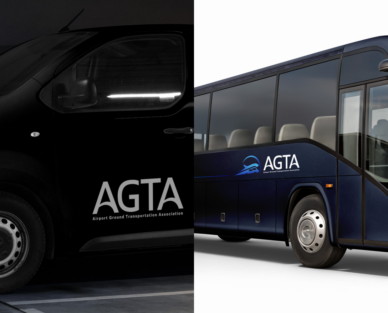
AGTA did not ask for a logo it liked. It asked for a mark that met a written specification: it had to hold both halves of the membership, airport authorities and ground transportation operators, in one form, carry the full name or the four letters alone, and stay legible from a van door to a website favicon. Several agencies entered.

Read the Requirements, Then Draw
Ibrahim Salah, Head of Design at Arqam Web, led the study of the brief and set the direction before anyone opened a drawing file. We produced a set of concepts against the specification rather than around it, and with Telgints we chose the one that answered the board's reading of the association, not the prettiest sketch on the table.

Adopted, and in Use
The entry went through to the final stage and won. AGTA adopted the mark and uses it officially: on the website header, on its social accounts, on stationery, badges and signage. Anyone can check the first of those by opening agtaweb.org.
Project Story
From vision to launch — every step, intentional
- AGTA ran an open competition to replace its existing logo, and several companies submitted entries
- Arqam Web took part through Telgints, which brought the brief to our design team
- The association set written requirements the mark had to meet before anything else was judged
- The requirements came from how the board sees the association: one body holding airports and operators together
- Ibrahim Salah, Head of Design, led the requirement study and ran every stage of the work that followed
- Turned the brief into design constraints: one unified form, not two symbols side by side
- Fixed what the mark had to survive: one colour, dark backgrounds, small sizes, vehicle livery
- Agreed the vocabulary the association uses about itself, from connectivity and safety to continuous improvement
- Produced a set of freehand concept directions around movement, connectivity and transport
- Reviewed each one against the written requirements rather than against taste
- Chose the direction with Telgints: a shuttle van and an airplane merged into a single form under an arc
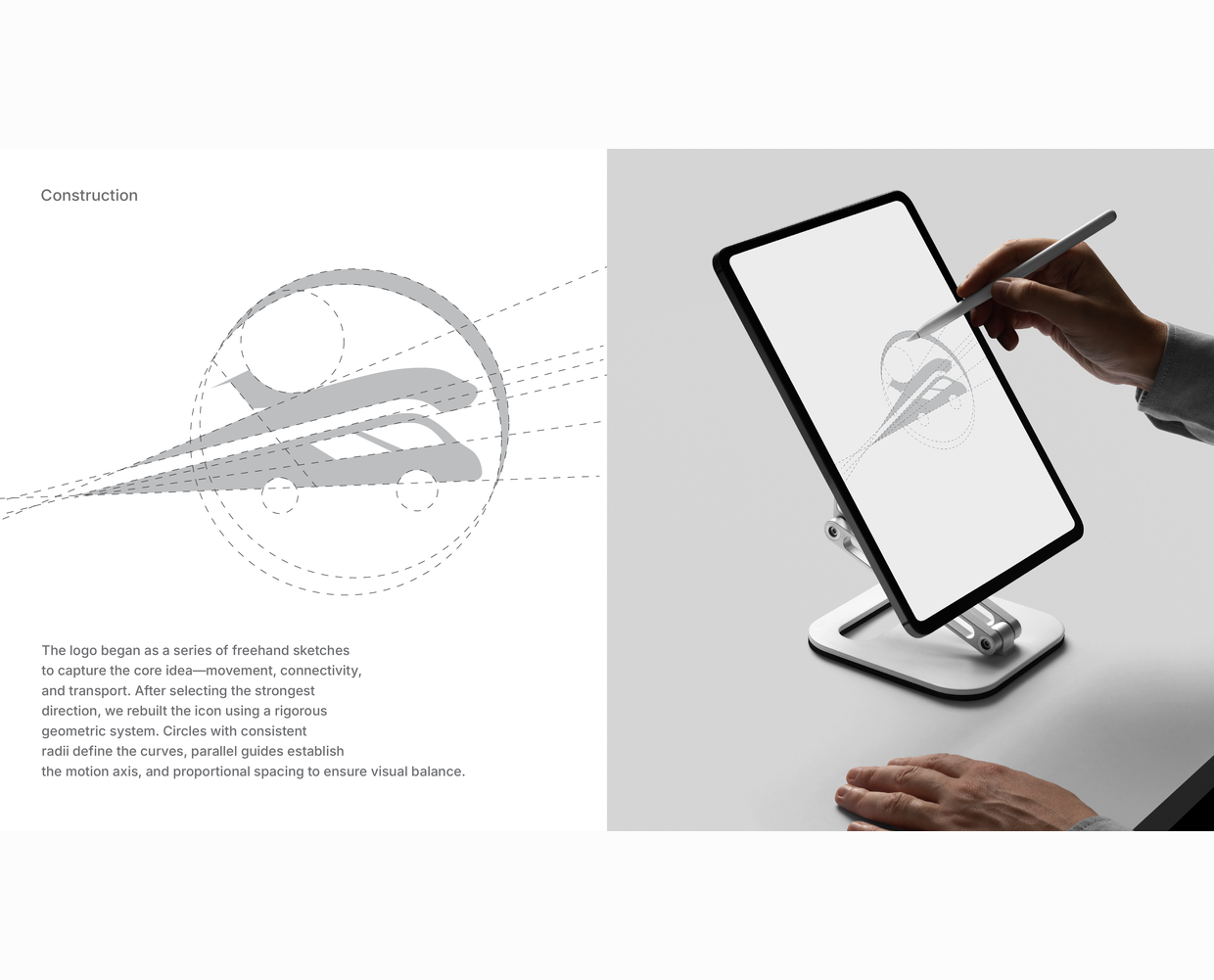
- Rebuilt the chosen icon on a geometric system of circles with consistent radii and parallel guides
- The submitted mark was carried through to the final stage of the competition
- Set the kerning of the four letters by hand, and fixed the clear space at 2X around the lockup
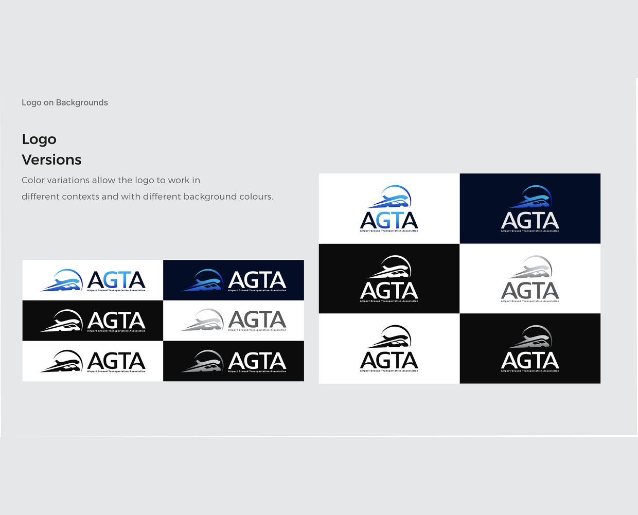
- Produced the colour, reversed, mono and outline versions so the mark holds on any background
- Presented the logo in use: website, social profiles, print, badges, signage and vehicles
- AGTA selected the entry as the winner and adopted it as the association's logo
- The mark went live on the AGTA website and across the association's accounts
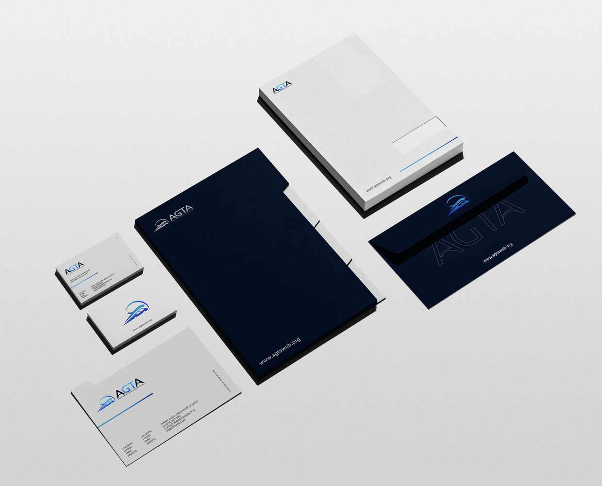
- Applied to stationery, member badges, event signage and fleet livery
- Delivered the full logo presentation with concept, construction, versions and application rules
What We Built
Performance & Delivery

One Mark, Both Halves of the Membership
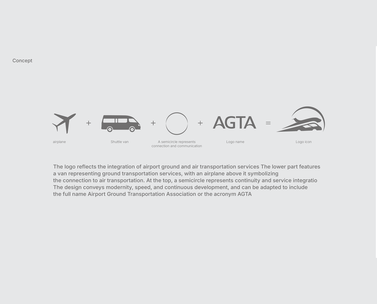
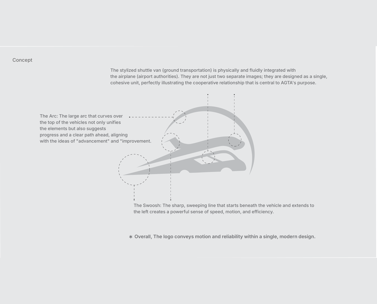
The icon merges a stylised shuttle van with an airplane so that ground transportation and airport authorities read as one object, not two symbols placed next to each other. That is the association's own structure drawn in a single form.

The Arc and the Swoosh
A semicircular arc sweeps over the vehicles and closes the mark, standing for continuity and connection. A sharp line runs out from beneath the van to the left, which is what gives the logo its sense of speed and direction at any size.

The AGTA Wordmark
The four letters were spaced by hand, with the G and T carrying the gradient that ties the wordmark to the icon. The lockup also runs with the full name, Airport Ground Transportation Association, set underneath in a single line.

A Geometric Construction
The icon started as freehand sketches and was then rebuilt on a grid: circles of consistent radii define the curves, parallel guides set the motion axis, and the spacing is proportional. That is what lets the mark be redrawn or scaled without losing its shape.

Twelve Versions and a Clear Space Rule
Two lockups, horizontal and stacked, each delivered in six background treatments: full colour on light, full colour on dark, white reversed, grey, black and outline. Clear space is fixed at 2X of the icon on every side.

Applications, Digital and Physical
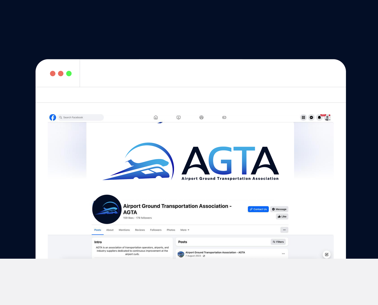
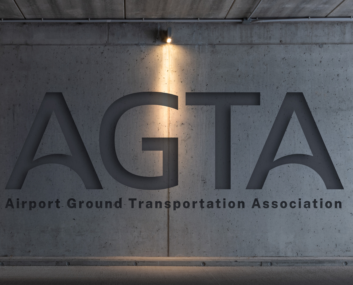
The logo was prepared and shown in use on the website, the browser tab, the Facebook page, business cards, the stationery set, member ID badges and lanyards, event flags, wall signage, apparel, the phone screen, and shuttle van and bus livery.
Behind the Results
Why this project succeeded

The Icon Says What the Association Does
Air and ground in one shape
A viewer who has never heard of AGTA can still read an airplane and a shuttle van in the mark. The association exists to move passengers between those two things safely and efficiently, and that is the whole idea the icon carries.

Built on Geometry, Not on a Lucky Sketch
Circles, guides and proportional spacing
The final icon sits on a construction grid, which is why it survives a favicon, an embossed wall sign and the side of a bus without being redrawn each time.

One Mark, Every Surface
Checked at real sizes before it was submitted
Every application was produced and reviewed at the size it would actually appear, from a 16 pixel browser tab to a vehicle door, rather than shown as thumbnails in a deck.

Live on agtaweb.org
Adopted as the official identity
AGTA now uses the mark as its logo. It sits in the website header, on the association's social profiles, and on the material its members see at conferences.
Sound Familiar?
What This Means For You
- Struggling with low traffic and zero visibility?
- Poor conversion rates despite good products?
- Slow, outdated website hurting your credibility?
- Competitors outranking you on every search?
Let's achieve similar results for your business.
Want a mark that holds up everywhere?
Send us what your organisation does and where its logo has to appear. You get a written scope with the versions, the file formats and the usage rules, before any drawing starts.
Related projects.
Kidana Travel Website
Custom Laravel Travel Platform with Online Booking
Kidana Travel Social Media
Social Media Marketing for Hajj and Umrah
Boya Store Website
WooCommerce Store for a Multi-Brand Paint Retailer