

دراسة حالة The Digger Hub:
عادوا إلينا من أجل بناء ثانٍ
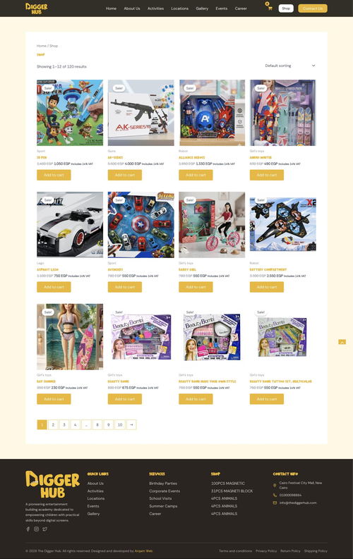
أكاديمية أنشطة للأطفال في القاهرة. بنينا الموقع، ثم عادوا إلينا فبنينا داخله متجر ألعاب يضم 120 منتجًا.
زيارة الموقع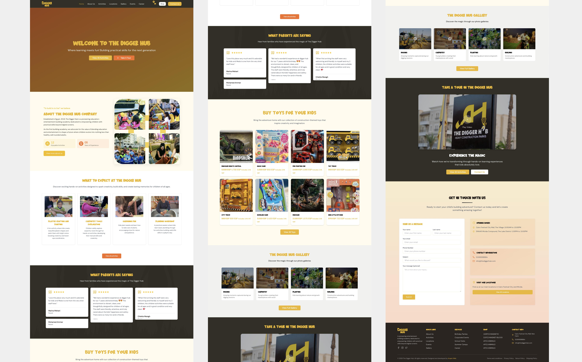
الأرقام تتحدث عن نفسها
Lead Generation
PageSpeed Score
Organic Traffic
Avg. Load Time
عرض بصري
صُنع بدقّة حتى آخر بكسل
نظرة عامة
كيف طوّرنا هذا العمل

المشكلة
مكان للأطفال يدفع الآباء ثمنه. كان على الموقع أن يشعرك بروح النشاط نفسه، وأن يبدو في الوقت ذاته عملًا تجاريًا تطمئن إلى ترك طفلك فيه، ثم كان عليه لاحقًا أن يحمل متجرًا لم يُصمم له أصلًا.

منهجنا
عرضنا عدة اتجاهات للتصميم وتركنا للعميل أن يختار موقع العلامة بين المرح والمصداقية. وحين جاء المتجر، بنيناه داخل البنية القائمة لا بجانبها، واختبرناه بعمليات شراء حقيقية قبل الإطلاق.

النتيجة
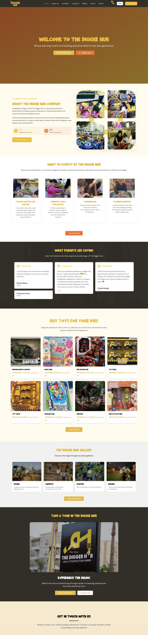
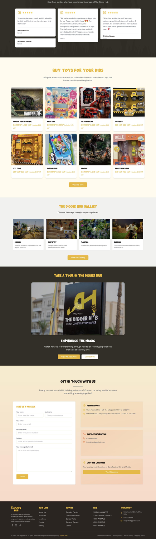
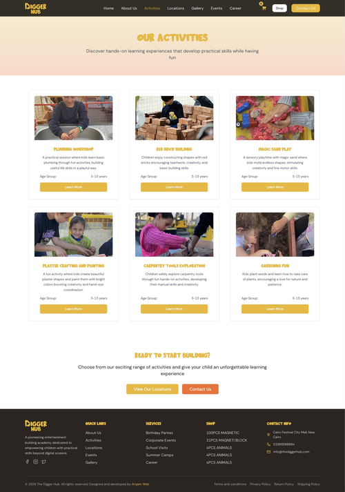
أنشطة، وألبومات صور، وفرعان، وتقييمات الآباء، إلى جانب متجر يضم 120 منتجًا في ثماني فئات مع سلة تسوق وصفحة إتمام الطلب وحسابات للمستخدمين. الموقع والمتجر يعملان معًا.
قصة المشروع
من الرؤية إلى الإطلاق — كل خطوة مدروسة
- Read the new brand identity the client had just adopted
- Produced several design directions rather than a single recommendation
- Left the balance between playful and credible for the client to choose
- Client chose a direction from the set
- Collected their additions and changes
- Implemented the list and presented the result
- Design approved
- Built the activities, each with its own page in its own content type
- Built four gallery albums and two branch pages
- Added the events page, the careers page and the parent reviews
- Launched
- New brief arrived some time after launch: a toy shop
- Constraint was to build it inside the existing structure rather than beside it
- Kept the same design language and the same navigation
- Built the shop into the same site: 120 products in eight categories
- Added cart, checkout and customer accounts
- Added the shipping, return and terms pages a real shop needs
- Tested it by running actual purchases end to end
- Site and shop both live
ما الذي بنيناه
الأداء & التسليم

Every Activity a Page of Its Own
Magic Sand Play, Plaster Crafting and Painting, Carpentry Tools Exploration, Gardening Fun, Plumbing Workshop and Red Brick Building, each with its own page in its own content type.

Two Branches, Two Pages
Cairo Festival City and Mivida each have a page of their own, because a parent choosing between them is choosing between two places, not reading one address list.

Four Gallery Albums
Digging, Carpentry, Planting and Building. The photography does what no description can: it shows the place with children in it.

Parent Reviews as Their Own Content
The reviews are a content type rather than text pasted into a page, so the client can add one without touching a layout.

A Shop of 120 Products
Eight categories, inside the same site and the same design, with cart, checkout and customer accounts.

The Pages a Real Shop Needs
Shipping policy, return policy, terms and conditions and a customer account area. A shop is finished when a customer knows what happens after they spend, not when it can take the money.
خلف النتائج
لماذا نجح هذا المشروع

The Client Came Back
The clearest thing anyone can say about a project.
The first engagement was a website. The second was a toy shop, decided by the management some time after launch, and they came back to us to build it. A returning client is harder to win than a first one, and it is the only review of the first project that carries any weight.

The Shop Had to Belong, Not Just Work
Attaching commerce to a site that never planned for one.
The straightforward path was to stand the shop up separately and link to it. We built it into the structure already there instead, so it uses the same design language and the same navigation, and a visitor moving from the activities to the toys is not handed off to what feels like another company.

We Tested It With Real Purchases
A checkout that looks finished is not the same as one that works.
Before the shop went live we put real transactions through it front to back, rather than trusting a page that rendered without errors. Payment flows fail in ways a design review never surfaces, and the only way to find that out is to buy something.

Design Directions, Not a Design
Several routes, and the choice was theirs.
For a brand aimed at children and sold to parents, the balance between playful and credible is a judgement the client is better placed to make than we are. Presenting several directions turned a debate about taste into a quick decision, and the revisions after it were about detail rather than direction.
هل يبدو هذا مألوفًا؟
ماذا يعني هذا لك
- تعاني من زيارات قليلة وظهور شبه معدوم؟
- معدلات تحويل ضعيفة رغم جودة منتجاتك؟
- موقع بطيء وقديم يضرّ بمصداقيتك؟
- منافسوك يتفوّقون عليك في كل عملية بحث؟
لنحقّق نتائج مماثلة لأعمالك.
هل أنت جاهز لبناء موقع إلكتروني يحقق لك أرباحًا فعلية؟
نبني مواقع ويب عالية الأداء، مصممة لتحقيق النمو وزيادة الإيرادات ونتائج أعمال قابلة للقياس.
ذات صلة مشاريع.
Kidana Travel Social Media
Social Media Marketing for Hajj and Umrah
موقع Mr Clone
صفحة واحدة مبرمجة خصيصًا لاستوديو توائم رقمية بالذكاء الاصطناعي
موقع Rabia
صفحة واحدة مبنية حول شعار